Car Configurator
Reducing complexity in high-stakes purchase decisions
Live B2C car configurator · Product Designer · End-to-end UX & UI · Cross-functional team
Designing a live B2C car configurator that helps users make confident purchase decisions by guiding them through complexity without removing choice.
Product Designer embedded in a cross-functional product team
Led UX and UI design across the configurator entry and key decision flows
Partnered closely with Product, Engineering, and Customer Insights through iterative discovery and validation
Shaped design decisions aligned with business KPIs and technical constraints
My Role
The Mercedes-Benz car configurator is a key step in the purchase journey, allowing users to explore and customise vehicles before moving forward in the sales funnel.
At the time, users had to start every configuration from scratch, manually selecting each option across a large set of models, features, and dependencies.
This resulted in high cognitive load early in the journey, particularly for users without a clear mental model of the vehicle, leading to hesitation, decision fatigue, and reduced confidence.
Research indicated an opportunity to better guide users at the start of the experience. By introducing curated starting points in the form of pre-configured vehicle concepts, the team hypothesised that users could make decisions more confidently, reduce effort, and progress more easily — while still retaining full flexibility to customise.
Context and Problem Framing
The solution needed to meet several functional and strategic constraints:
Pre-configurations had to be brand-agnostic, while initially focusing on AMG
The approach needed to scale across all vehicle classes and sub-brands
Different display strategies had to be explored (placement, themes, categorisation, user journey)
The concept needed to work within existing business rules and configuration logic
Constraints & Requirements
Research Foundation & Collaboration
Initial discovery identified early signals that users valued guidance when starting a configuration, particularly through curated starting points such as pre-configurations. Building on this foundation, we iteratively designed, tested, and refined solutions to validate assumptions and shape a scalable approach.
This work was conducted in close collaboration with:
A UX designer colleague, partnering on exploration and design direction
A Customer Insights researcher, leading research planning, testing, and analysis
My role focused on translating insights into design strategy, interaction models, and UI solutions, and iterating on them based on research findings.
Solution Strategy & Key Decisions
Based on iterative qualitative research, usability testing, and quantitative validation, the solution focused on guiding users through complexity without removing choice.
Rather than introducing a single “correct” configuration or forcing a linear flow, the strategy centred on curated starting points that reduce cognitive load while preserving flexibility, transparency, and user control.
1. Introduce pre-configured vehicle concepts as guided entry points
Research consistently showed that starting from a blank configuration felt overwhelming, particularly for users without a clear mental model of the vehicle.
Pre-configured concepts provided a faster and more confident way to begin.
Key decisions:
Limit concepts to 3–5 options to avoid reintroducing overload
Anchor concepts around clear, concrete benefits (e.g. Efficiency, Comfort, Performance)
Keep concepts brand-agnostic and scalable across classes and sub-brands
2. Make differences visible early to support confident choice
Testing revealed that users wanted to understand why configurations differed before committing. When differences were unclear, users defaulted to starting configuration just to “find out,” creating friction.
Key decisions:
Surface price, engine specifications, and key equipment highlights upfront
Use descriptive naming rather than abstract or emotional labels
Support comparison without forcing users into deep configuration steps
3. Balance guidance with user control
While guidance was valued, users expressed concern about “missing out” by not seeing every option. The experience needed to build confidence without limiting autonomy.
Key decisions:
Keep the full configuration accessible at all times
Clearly position pre-configurations as starting points, not constraints
Use CTAs that reinforce agency (e.g. “Configure Performance”)
4. Reduce distraction and focus attention in the MVP
Later testing showed that additional features and visual noise reduced understanding of what pre-configurations were and how to use them.
Key decisions:
Simplify the start experience by removing non-essential elements
Prioritise clarity over richness in the MVP
Defer secondary information until after a configuration path is chosen
The design approach evolved alongside research and validation, using iterative design to test, refine, and operationalise the strategy.
The design approach focused on translating the strategic pillars into clear interaction patterns, information hierarchy, and decision flows that could be validated incrementally and scaled over time.
Design Approach
1. Structure the entry point to reduce cognitive load
The start of the configurator was designed as a decision orientation moment, not a configuration task.
Instead of asking users to define preferences upfront, the experience introduces a small set of curated pre-configurations that help users understand the landscape of options before making any commitment.
Design focus:
Present a limited number of clearly differentiated concepts
Use strong hierarchy to make each option scannable
Prioritise clarity and comparability over visual richness
2. Use progressive disclosure to support understanding
Information was intentionally layered to avoid overwhelming users early in the journey.
High-level decision drivers were surfaced first, while deeper technical details remained accessible when needed. This allowed users to form an initial preference without being forced into detailed configuration steps.
Design focus:
Show price, engine type, and key highlights upfront
Reveal extended details through expandable content
Maintain a clear distinction between “choosing a direction” and “configuring details”
3. Reinforce user agency at every step
A core design principle was ensuring users never felt locked into a decision.
Pre-configurations were designed as editable foundations, with clear affordances and language reinforcing that all options remained accessible.
Design focus:
Explicit, action-oriented CTAs (e.g. “Configure Performance”)
Clear transitions into the full configurator
Consistent signals that choices could be revisited and adjusted
4. Design for MVP clarity, not feature completeness
As the solution progressed toward MVP, the focus shifted to protecting comprehension at the most critical moments of the journey.
Elements that distracted from understanding pre-configurations were intentionally deprioritised to ensure users clearly understood what the concepts were and how to use them.
Design focus:
Reduce competing entry points
Simplify layouts and interactions
Sequence information intentionally rather than presenting everything at once
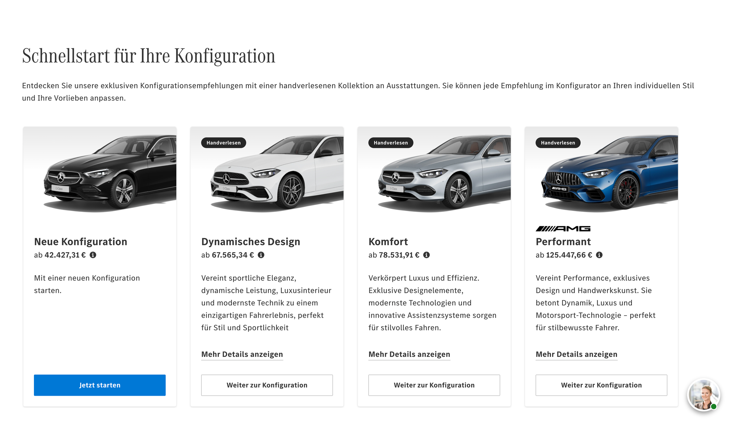
Final Design — MVP Implementation
The solution was implemented as an MVP and deployed in a single market to validate the approach before broader rollout.
The release prioritised testing:
The interaction model
Information hierarchy
Decision flow and user confidence
You can see the MVP live for the Germany market here.
The MVP contributed to clear improvements in usability and decision confidence, supporting key business goals in a high-stakes purchase journey.
By introducing guided entry points, the experience reduced early-stage friction and helped users move forward with greater clarity and confidence. Users engaged more quickly with configurations and were less likely to abandon the process due to uncertainty or overload.
The solution also created clearer exploration paths, allowing users to compare configurations, understand trade-offs, and progress without feeling locked into a single choice.
Deployed in a single market as an MVP, the feature provided a validated foundation for further iteration and broader rollout, balancing user needs, business KPIs, and technical constraints.
Impact
This project reinforced the importance of structuring complexity rather than removing it.
Key learnings included:
Guidance is most effective when paired with transparency and reversibility
Early decisions benefit from benefit-led framing rather than technical detail
MVPs are not about shipping everything, but about validating the right things first
Design, research, and strategy are most effective when allowed to evolve together
What I Learned
This work reflects how I approach complex product problems: balancing user confidence, business goals, and technical constraints through iterative, evidence-led design.